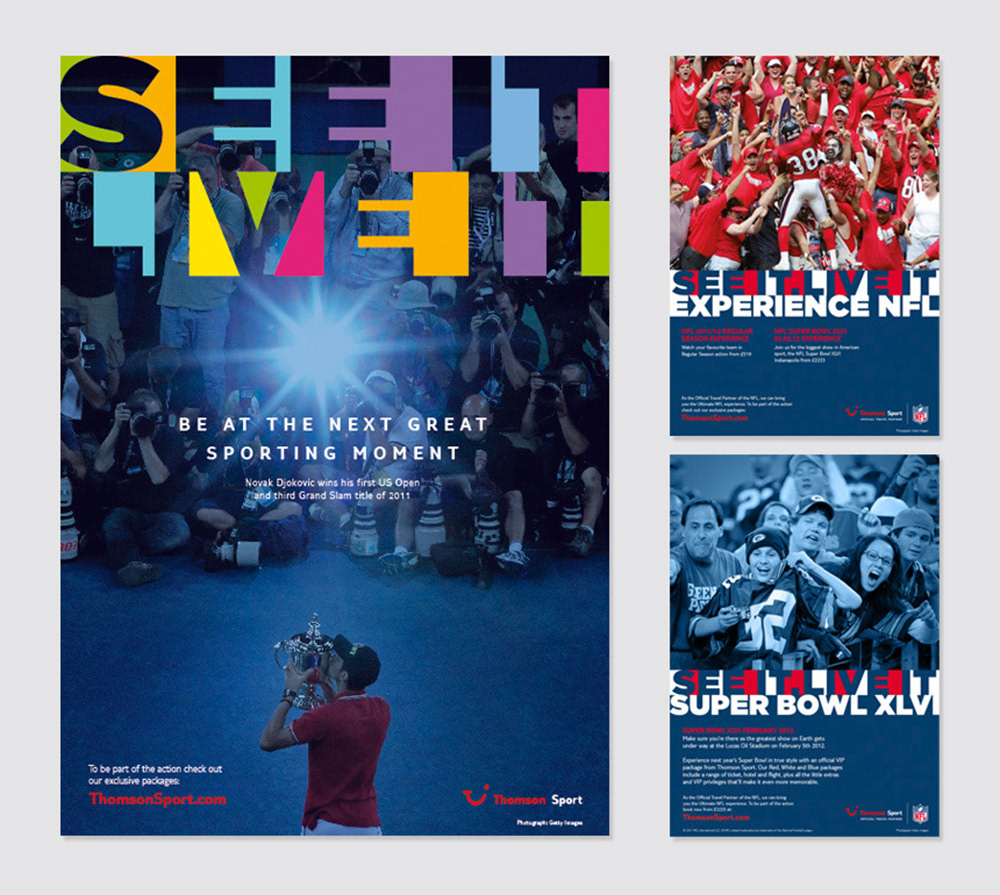
Thomson Sport aims to be the Number One in the UK sports event package market. In order to achieve this goal it needed to widen its audience appeal, be more consumer oriented and create an inspiring brand that truly owns sports package holidays. As part of a brand strategy and visual Identity programme, the consumer is placed at the centre of the experience, communicating the excitement of being at an unmissable sporting moment.
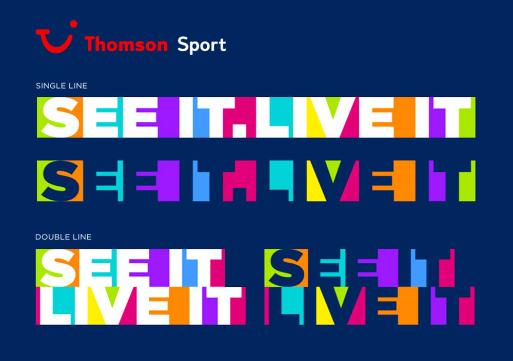
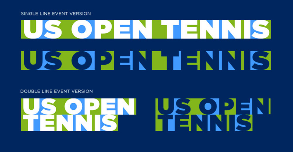
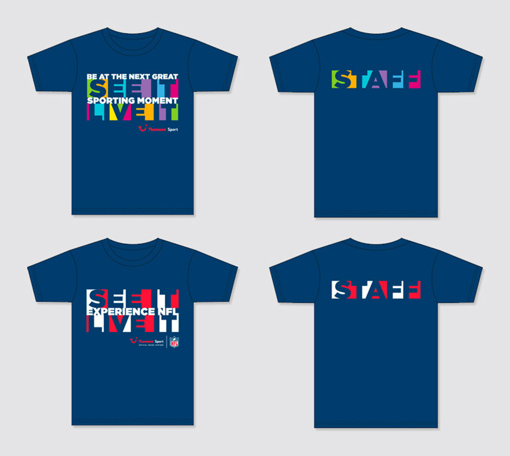
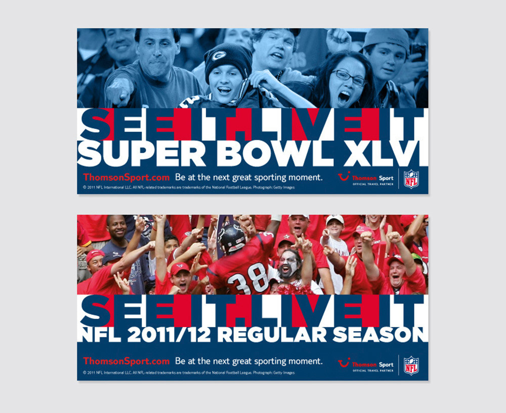
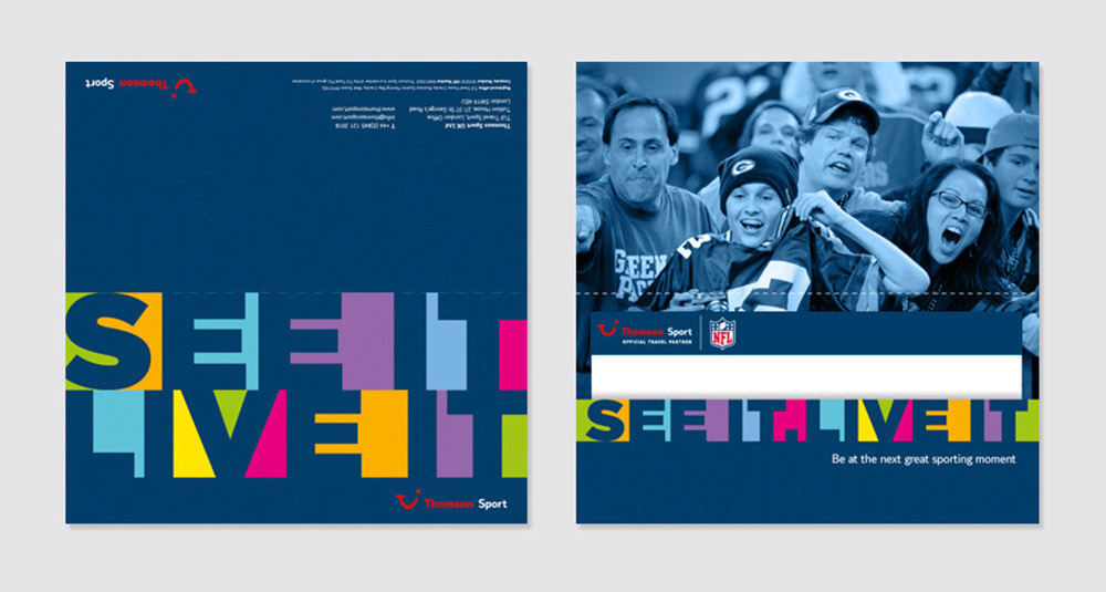
Thomson Sport is part of TUI Travel PLC and has to conform to rigid corporate identity guidelines, which mean’t I couldn't mess with the logo. My solution was to create an identity with a powerful and ownable strapline that could be used with the Thomson Sport logo, making the brand more inspiring and engaging but differentiating it from other brands in the TUI group. As well as a main multi-coloured version of the See It. Live It strapline, the graphic style can be used to head up the events, utilising the specific event colours where appropriate.
Thomson Sport is part of TUI Travel PLC and has to conform to rigid corporate identity guidelines, which mean’t I couldn't mess with the logo. My solution was to create an identity with a powerful and ownable strapline that could be used with the Thomson Sport logo, making the brand more inspiring and engaging but differentiating it from other brands in the TUI group. As well as a main multi-coloured version of the See It. Live It strapline, the graphic style can be used to head up the events, utilising the specific event colours where appropriate.